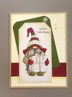
Hello and welcome.
Here is the final Gnome in the cart series.
This digital image from KLM Digital Designs was first seen on my blog HERE. The GREAT news is that is is now available as a polymer stamp over at the site!!
The tutorial for how to fill the cart is in THIS post. The Christmas Cart Gnome was popular.
Recently you saw the Valentine cart.
Finally the Spring Gnome cart is here.
It looks familiar because it was the one used in the tutorial.
The Gnome was colored with Copics and mounted on a watercolor background.
All the supplies are pretty much the same as all the other cart cards so, I won't bore you with more specifics.
I have, however, received some messages again, about detailing the images. The images you receive are a clean line drawing. They are that way to allow customers to detail them as they choose for their needs.
The following links are to the tutorials addressing
Detailing the beard
Detailing digital images
I hope you find these helpful.
Susan
Showing posts sorted by relevance for query Tutorials. Sort by date Show all posts
Feb 29, 2020
Mar 30, 2022
Series of Easter Cards
Good morning, afternoon, or evening.
I am still playing with my new Lavinia Designs stamps. Their videos on you tube are great! Very informative and good for a chuckle often. I love Jo Rice tutorials.
Today I will share the last of the Easter cards, I think!As I mentioned before, all these backgrounds started with a pile of gel press circle prints that were in my background box. I usually make a bunch of papers once a month to play with later. It makes for quick designing when the paper is already made and dry ready to go.
On this card I stenciled the corners with a Lavinia stencil and Distress Ink, then used torn paper as a mask to create the scene background. The stamps are all from my latest splurge at DelBello's Designs. I'd been very good and not ordered ANYTHING since November. So, I decided to treat myself 😉.
I used Distress Inks and Copics to add color to the vine and flowers.
This card uses all the same techniques as above. I don't have very many of Lavinia's foliage type stamps so, I went searching in my collection for something that might work. I ended up with an OLD Stampin'UP set called Pocket Silhouettes. I think this set has seen as much use as Lovely as a Tree! One of my better purchases.
The bunnies and top vine are from Lavinia's.
This last Easter card follows the same format. All the stamps and stencil are Lavinia's with the exception of the Easter sentiment which is from a very old PTI set.
If you haven't tried making backgrounds, give it a shot. You won't regret it. I usually decide what technique to use (gel press- small or large, ink dipping, spray ink, alcohol ink, for example), then do a series of colors depending on what is in my file already. I work all the colors I need, dry them and file them, ready to go. On a really good morning I can fill the files and move on to card design in the afternoon.
Try it, you'll like it!
Jul 30, 2021
DREAM with Tim Holtz
Welcome to Creative Juice! My stress free zone for creating.
Squeaking in a quick post during a very busy next few weeks with the grandkids. I am having a lot of fun stretching this old gray matter to learn new techniques and new materials.This card was inspired by Stacy at Tattered Nest designs blog post of May 3, 2021. If you love Tim Holtz style, follow her blog. She is AMAZING and has fabulous tutorials.Here is the breakdown for this fun card.
Dies: MFT- Stitched Tags and Stitched Rectangles STAX
Sizzix -Mix Media #1 and Thinlits Wildflower Stems 1
Stamps: Stampers Anonymous-THMM119;
SU- Botanicals
Stencils- Stampers Anonymous- Lace and Mini Stencil
Set 1(THMST001)
Darkroom Door - Journey (DREAM)
Tombow markers (flower watercolor)
Washi tape- Recollections (Michael's)
Distress Crayons - White, Antique Bronze
Distress Texture Paste Matte, Distress Collage Medium Matte
The tag was mono printed with the Lace stencil
There is what looks like a resist of the flower on the background. It is actually ink blending over a die cut of the flower onto an ink blended background.
Lesson learned here: The color under the texture paste will show through unless the color is sealed with gesso or collage medium. (see numbers) DREAM is actually much less white in real life, but I did add white crayon to the letters to brighten them.
I really like the texture of the papers created by the collage medium.
Enjoy your weekend!
Jul 6, 2020
Eco Print Maples and Bird
Hello there. Welcome, I hope you like what you see.
Recently I have been doing some experimenting with eco printing on paper. It certainly is a trial and error process. The results are much like working with alcohol inks. Every batch is a surprise.
This card is one of my favorites from a batch that I used tea as the dye on watercolor paper soaked in an iron/vinegar mordant. Those leaves are from a beautiful Japanese Maple in my yard.
I used the Sizzix Thinlits Feathered Friends to cut another piece of printed paper that didn't come out as well for the body of the bird. The base of the bird and the wing were cut from black card stock that had been treated with copper and silver Ranger Mixatives. I used Brushed Corduroy Distress Ink to brush a little extra color onto the birds back and leg areas.
The sentiment is from Idea-ology Small Talk spiral bound sticker sheets.
There are several You Tube videos and tutorials on Pinterest. They all do a little something different.
THIS is the one I used to begin exploring this fun technique.
Have a great week,
Susan
Sep 29, 2019
Texture tutorial for gnomes
Good morning everyone. It's time for me to step out of my comfort zone and do something NEW! Katy, over at KLM digital designs, and I have received many questions on how the beards of the gnomes are colored. The images are not overly detailed deliberately. This was to allow for individuals to detail them as they see fit. Shading is a personal preference as is adding other details like stripes, snowflakes, or dots.In this image the snowflakes on the hat are part of the image, but overdrawn with a glitter gel pen. The package is blank allowing for personalization so I chose to mimic the snowflakes.
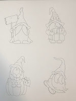
On to the beard... begin with a page of images to practice on. I usually print 4 to a page. To begin I would scale them around 3.73 to 4.0 inches as the smaller you go the less detail you will want.
For this tutorial I will use Copic markers in the T range of gray.
T0, T2,T3, T4 and a Copic multiliner 0.1
Note: all gray is not the same. Depending on the colors of Gnomes clothing or the card design you may want different colors. The basic process is the same, though.
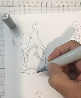
My first step is to block in the shadow areas with my lightest color. I'm right handed so I nearly always shade my images with the light coming from that direction. I use the flick stroke on the beards. HERE is a great tutorial on this technique.
Next, I flick in the darkest shadows. I begin where the darkest shadow will be and flick towards the lightest area with my T3. I flick top down and bottom up on the beard and mustache so there will be a natural highlight around the middle area. Be light, you can always lengthen and add more. It's harder to take it away. Always move in the direction the hair will fall. His mustache is rather groomed so the lines should follow the shape of the mustache. Note: Here I am using a bullet point marker as I don't own a Sketch in this color. The lines are a little more defined than I usually like but the following steps will solve that issue.
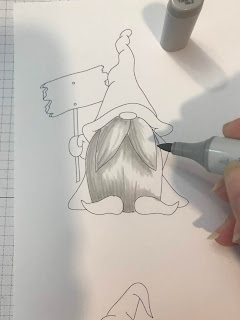
I go over the shadows, with a T2, softening the harder strokes and pulling the lighter color a little further into the uncolored area. Flick, flick is the trick!
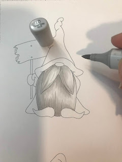
Now I go back over the shaded areas LIGHTLY, just to blend in any harsh transitions between colors. There are still some areas that remain uncolored. This helps create a bit of a highlight.
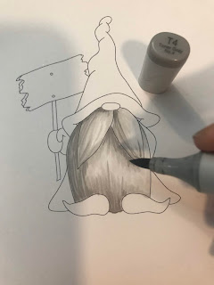
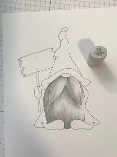
I am a contrast person. I like a lot of it. The shadows were not deep enough for me so I added a bit of T4 in the darkest areas with short flicks. I often find myself adding a darker tone to all my shadows to create more dimension.
I go back again with T0 to flick out any hard transitions. You can see the difference between the last photo and this one. Still keep some of that white area for highlight.
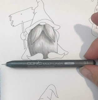
This is the magic tool. There are several makes of fine liners you can use. I use this very fine one because I like to add the detail in layers.
Begin in the area of the dark shadow. Flick lightly with this pen as well. Remember, you can always add more its harder to lighten. It is important to work both top down and bottom up with this pen. It makes for a more natural look.
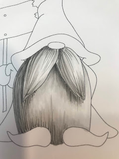
Continue to add fine flicked lines in the shadow areas. Lines placed close together will give a darker shadow. As you want to lighten the shadow and add texture to the lightest areas, space lines farther apart and use a lighter touch.
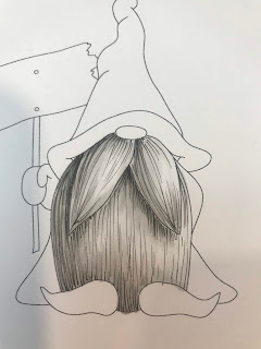
Here you can see the variations in the lines. I did go back to add lines to the left side of both sections of his mustache to make it look a little more prominent.
I still wanted more contrast so I added just a touch more of T4 where the deepest shadows would fall.
I hope this will help. Shading is a learning process. It is really a matter of observation and practice. You don't need to color with Copics, just practice with the tools you have.
Sandy Allnock has amazing tutorials in many mediums. She makes shading and how to do it so easy to follow. I strongly suggest checking her out.
Until the next time... practice, practice.
Susan
Subscribe to:
Posts (Atom)


